Notifications

12 minutes, 53 seconds
-19 Views 0 Comments 0 Likes 0 Reviews
Design trends come and go, but neon colors have made a powerful comeback that shows no sign of slowing down. From social media graphics to brand identities, neon hues are lighting up screens across every industry. Whether you are a seasoned graphic designer or just starting your creative journey, understanding how to use neon color palettes can completely transform your work.
Neon colors are not just bold — they are electric. They carry energy, excitement, and a sense of the futuristic. When used thoughtfully, they can make your designs stand out in a sea of muted, neutral tones. In this guide, we will walk you through the most trending neon color palettes right now, how to use them effectively, and why every designer should experiment with these vibrant combinations.
Before we dive into the trends, it helps to understand what we mean by a neon color palette. A color neon palette typically refers to a set of highly saturated, luminous colors that mimic the glow of neon lighting. These colors are usually bright versions of green, pink, yellow, purple, orange, and blue — often described as fluorescent or electric in appearance.
In digital design, neon colors are created using high RGB values that push brightness to the extreme. In print, they often require special fluorescent inks to achieve that same glow effect. What makes neon palettes so powerful is their visual intensity — they immediately grab attention and create a lasting impression on the viewer.
One of the biggest drivers of the neon revival is the return of Y2K and early 2000s aesthetics. Millennials and Gen Z designers have been embracing the bold, unfiltered style of late-90s and early-2000s design — complete with neon accents, glossy textures, and chrome effects. Platforms like Instagram, TikTok, and Pinterest are full of content celebrating this throwback visual language.
Dark mode interfaces have become the norm across apps, websites, and operating systems. And neon colors pair beautifully with dark backgrounds. Against black or deep navy, a neon accent color practically glows. This has made neon palettes especially popular in UI/UX design, gaming interfaces, and tech branding.
Brands today are building identities primarily for digital screens. Unlike print, digital screens can display highly saturated, luminous colors with full intensity. This has freed designers to go bolder than ever before, and neon palettes have naturally risen to meet that creative freedom.
This palette is one of the most popular combinations in tech and gaming design right now. Pairing a vivid neon green (think #39FF14 or #00FF41) against a deep black background creates a matrix-inspired, futuristic feel. It is clean, high contrast, and unmistakably bold.
Best used for: Tech startups, gaming brands, cybersecurity platforms, dark-themed websites.
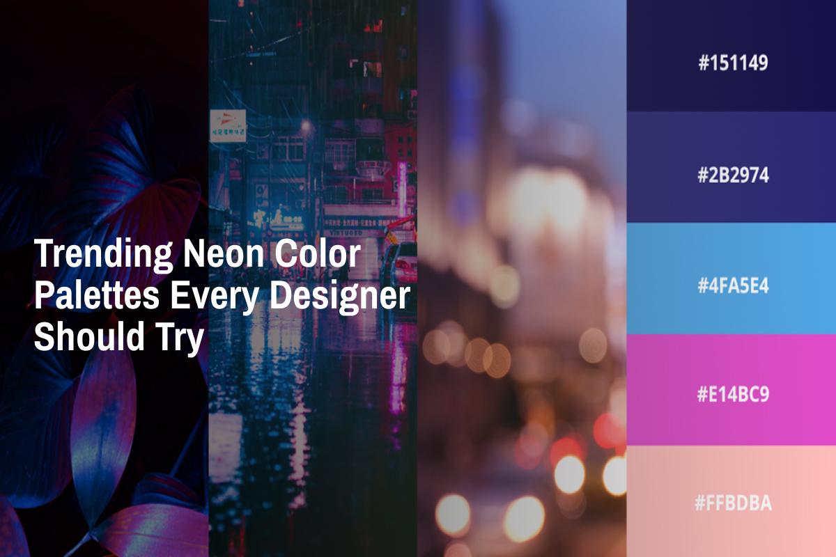
The synthwave palette is inspired by 80s retro-futurism and has become a staple in music, entertainment, and gaming branding. This palette typically includes hot pink (#FF2D78), electric purple (#BF00FF), and a deep navy or dark indigo background.
It evokes nostalgia while still feeling edgy and modern. Many popular streaming platforms and music apps have used versions of this palette to great effect.
Best used for: Music apps, event posters, entertainment brands, creative agencies.
This is a high-energy palette that feels urgent and innovative. Neon yellow (#FFFF00 or #F4D03F pushed to extremes) paired with electric blue (#00B4FF) creates a sharp, eye-catching contrast. It is a palette that demands attention without being aggressive.
Many sports brands, fitness apps, and energy drink companies have leaned into this combination for its active, motivating feel.
Best used for: Sports brands, fitness platforms, energy and wellness products.
Warm neon tones have been gaining popularity as a softer alternative to the more aggressive cool neon palettes. This combination features neon orange — a vibrant, eye-catching hue like #FF6600 or #FF4500 — blended with hot pink and clean white space.
It feels energetic but approachable, making it ideal for lifestyle, fashion, and food brands. The warmth of the orange and pink tones creates a feeling of excitement without overwhelming the viewer.
Best used for: Food brands, fashion labels, lifestyle blogs, social media content.
If you want a palette that feels both futuristic and clean, the Ice Rave combination is a great choice. Pairing neon blue (#0000FF at full saturation) with neon cyan (#00FFFF) against white or light gray backgrounds creates a sharp, modern feel. It is frequently used in healthcare technology, fintech, and SaaS product design.
Best used for: Fintech, SaaS products, health tech platforms, corporate modern branding.
Acid pop is one of the more daring neon palette choices. It takes full-saturation neon green and neon yellow and places them against stark black, creating a palette that feels like street art brought to screen. It has been embraced by streetwear brands, underground music labels, and bold fashion designers.
Best used for: Streetwear, underground music, bold fashion brands, youth-focused campaigns.
One of the most common mistakes designers make with neon colors is using them as a background or dominant color across an entire layout. Neon hues are highly saturated and can cause eye strain when used in large quantities. Instead, use them as accent colors — for buttons, highlights, icons, or typographic elements.
The most effective neon designs are ones that balance the brightness with plenty of neutral space. Dark blacks, deep grays, and crisp whites act as visual breathing room that lets the neon elements pop without exhausting the viewer.
When placing text on or near neon colors, ensure that contrast is maintained for readability. White or black text on neon backgrounds can work, but always check your contrast ratios for accessibility compliance.
Because neon colors behave differently on different screens — OLED vs. LCD, mobile vs. desktop — always test your palette across multiple devices before finalizing a design.
Web designers have embraced neon for hero sections, call-to-action buttons, and hover effects. A neon green or pink CTA button on a dark background creates an irresistible click target. Neon gradients are also trending in background treatments for landing pages.
Brands like Mountain Dew, Xbox, and various streetwear labels have long understood the power of neon in creating bold, memorable identities. For new brands, a well-chosen neon color can signal energy, innovation, and boldness — all qualities that resonate strongly with younger audiences.
Neon colors perform exceptionally well in social media environments where your content competes for attention in a fast-scrolling feed. High-contrast, neon-accented graphics tend to stop the scroll more effectively than soft or muted designs.
With fluorescent inks widely available, neon in print has become more accessible. Product packaging in neon hues stands out on retail shelves, and promotional materials printed in neon command attention at events and trade shows.
A palette with four or five neon hues can quickly look chaotic and unprofessional. Stick to one or two neon accent colors paired with neutrals for the most polished result.
Bright neon tones can present accessibility challenges, particularly for viewers with visual impairments or sensitivities to bright light. Always run your designs through accessibility checkers and ensure text contrast meets WCAG standards.
Neon works beautifully in the right context, but it is not a fit-all solution. Luxury brands, minimalist editorial designs, and professional services brands may not benefit from neon aesthetics. Always align your color choices with your brand voice and target audience.
Neon color palettes are more than just a trend — they are a powerful design tool that, when used with intention, can elevate a brand, energize a layout, and create memorable visual experiences. From the synth wave pinks and purples of retro-inspired branding to the warm, inviting glow of neon orange in lifestyle design, the possibilities are vast and exciting.
As a designer, experimenting with neon colors opens up a world of creative expression. The key is balance — pairing these vivid hues with the right neutrals, using them as strategic accents, and always keeping your audience's experience at the center of every decision.
Whether you are refreshing an existing brand, working on a new UI project, or creating content for social media, there is a neon palette on this list that can add exactly the spark your work needs. So pick up your design tool of choice, start experimenting, and let the neon glow guide your next masterpiece.
neon color palette color neon palette neon orange neon colors neon design

